Statistical quality control charts, or Shewart quality control charts, are used across nearly all sectors of industry to maintain and improve product quality. Quality control charts provide a means to detect when a time varying process exceeds its historic process variation and needs analysis and/or intervention to remedy the out-of-control process (known as special cause variation). These process control charts are independent of any engineering decision-making about the particular process at hand, but are instead based on the statistical nature of the process itself. This standardized statistical control framework was created and refined by Walter Shewart at Bell Telephone Laboratories from 1925 to his retirement in 1956. It is this independence of process details that make Mr. Shewart’s techniques powerful, widely applicable, decision-making aids.
With their ongoing partnership, CenterSpace Software and Nevron have teamed up to create some free code examples for creating Shewart charts.
Quality Chart Types
Statistical quality control charts can be generally divided into two categories, those for tracking discrete attribute variables (e.g. a pass/fail test), and those for tracking continuous process variables (e.g. pipe diameter, temperature).
| Chart | Process Observation | Process Observation Variable |
|---|---|---|
| X-bar and R chart | Quality characteristic measurement within one subgroup | Variables |
| X-bar and s chart | Quality characteristic measurement within one subgroup | Variables |
| Shewhart individuals control chart (I-R chart or I chart) | Quality characteristic measurement for one observation | Variables |
| Three-way chart | Quality characteristic measurement within one subgroup | Variables |
| p-chart | Fraction nonconforming within one subgroup | Attributes |
| np-chart | Number nonconforming within one subgroup | Attributes |
| c-chart | Number of nonconformances within one subgroup | Attributes |
| u-chart | Nonconformances per unit within one subgroup | Attributes |
The statistical modeling language, “R”, provides a package (qcc) for creating these and other statistical process control charts. This R package was created by Luca Scrucca and is actively maintained and can be found in CRAN repository.
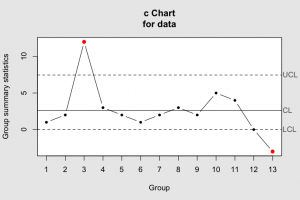
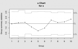
These two images demonstrate the standard look of the ‘c’ and ‘u’ attribute quality control chart. Some typical chart features include the highlighting of out-of-control data points and time varying upper and lower control limits. The charts generated by the R qcc package have served as our standard for recreating these in the .NET / C# development environment. The real world data used in our examples below was copied from the qcc package so direct comparisons can be made.
Creating a Quality Chart with .NET
To integrate these quality controls charts into a .NET/C# data driven quality monitoring application, we need both a statistical analysis library and a visualization tool that can manage the special chart style demanded by quality control engineers. CenterSpace, in partnership with Nevron, has created an extensible example application to build these types of specialized charts. Once you have these free helper classes, building an attribute u-chart is as simple or simpler than prototyping charts in R.
    public void UChart()
    {

      // u-Chart sample data
      // This data-set was copied from the 'dyedcloth' data set packaged with
      // the R-package qcc by Luca Scrucca
      //
      // Example Data Description
      // In a textile finishing plant, dyed cloth is inspected for the occurrence of
      // defects per 50 square meters.
      // The data on ten rolls of cloth are presented
      //    x number of nonconformities per 50 square meters (inspection units)
      //    samplesize number of inspection units in roll (variable sample size
      DoubleVector x =
        new DoubleVector(14, 12, 20, 11, 7, 10, 21, 16, 19, 23);
      DoubleVector samplesize =
        new DoubleVector(10.0, 8.0, 13.0, 10.0, 9.5, 10.0, 12.0, 10.5, 12.0, 12.5);

      // This builds the statistical information for the drawing the chart.
      IAttributeChartStats stats_u = new Stats_u(x, samplesize);

      // Build and display the Nevron u-Chart visualization
      NevronControlChart.AutoRefresh = true;
      NevronControlChart.Clear();
      AttributeChart cChart =
        new AttributeChart(stats_u, this.NevronControlChart);

    }
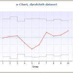
This code creates a u-Chart that looks like this below.
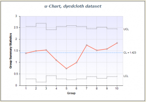
For those familiar with the aforementioned R-package qcc, these .NET/C# classes follow the same R naming convention for the particular chart statistics objects, but with an improved object model. So as seen in this example, the u-chart statistics are contained in a class named Stats_u, similar to the R stats.u command. Each of these statistical chart objects implements either an IAttributeChartStats or an IVariableChartStats interface, which is used by the chart generating class (AttributeChart) as seen in the last line of the code above.
Building control charts boils down to three steps using these example classes.
- Build the necessary data vectors.
- Build the desired chart’s statistics object,
e.g.IAttributeChartStats Stats = new Stats_c(DoubleVector data); - Show chart using Nevrons .NET chart control,
e.g.new AttributeChart(IAttributeChartStats Stats, NChartControl Chart)
Free Example Code
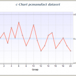
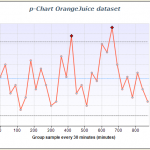
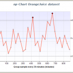
The example code now available on github can currently create all four essential attribute quality control charts, as seen below.
To download and run these examples just navigate to our Nevron / CenterSpace github repository and either click on the “Download Source” button in the upper right-hand corner and download either a .zip or .tar file of the project, or just clone the repository. For those unfamiliar with git, git is a source code control system designed specifically for collaborative projects such as this one. To clone the project, after installing git, simply type at your command prompt:
git clone git@github.com:MilenMetodiev/CenterSpaceNevronExamples.git
This will create a clone of this project code at your current drive location in a directory call “CenterSpaceNevronExamples”.
Other Quality Control Charts and Future Development
Currently we have only implemented the attribute control charts. Other common quality system charts including EWMA (exponential weighted moving average), Pareto, and CumSum (cumulative sum) have not been implemented in this example, but can be using the same tool set and class patterns established in this example. If you would like help or need any assistance in getting the project running or extending this to other chart types, drop us an email .
Happy Computing,
-Paul
Resources
- The table above is adapted from the Wikipedia control chart article.
- “qcc: An R package for quality control charting and statistical process control”, R News, Volume 4/1 , June 2004.
- The standard qcc documentation from the CRAN project was very helpful with this project.

It’s always interesting to learn of industry specific kpis and charts like these. It’ll be helpful when talking to manufacturing clients to be familiar with some of these engineering ones.
Thanks Dashboard, I hope these charts can be of use for your clients – they are widely applicable as I hope the examples demonstrated.
Cheers.
I want to know about the control charts based on geometric distribution. Can you post something about it